
Anúncios
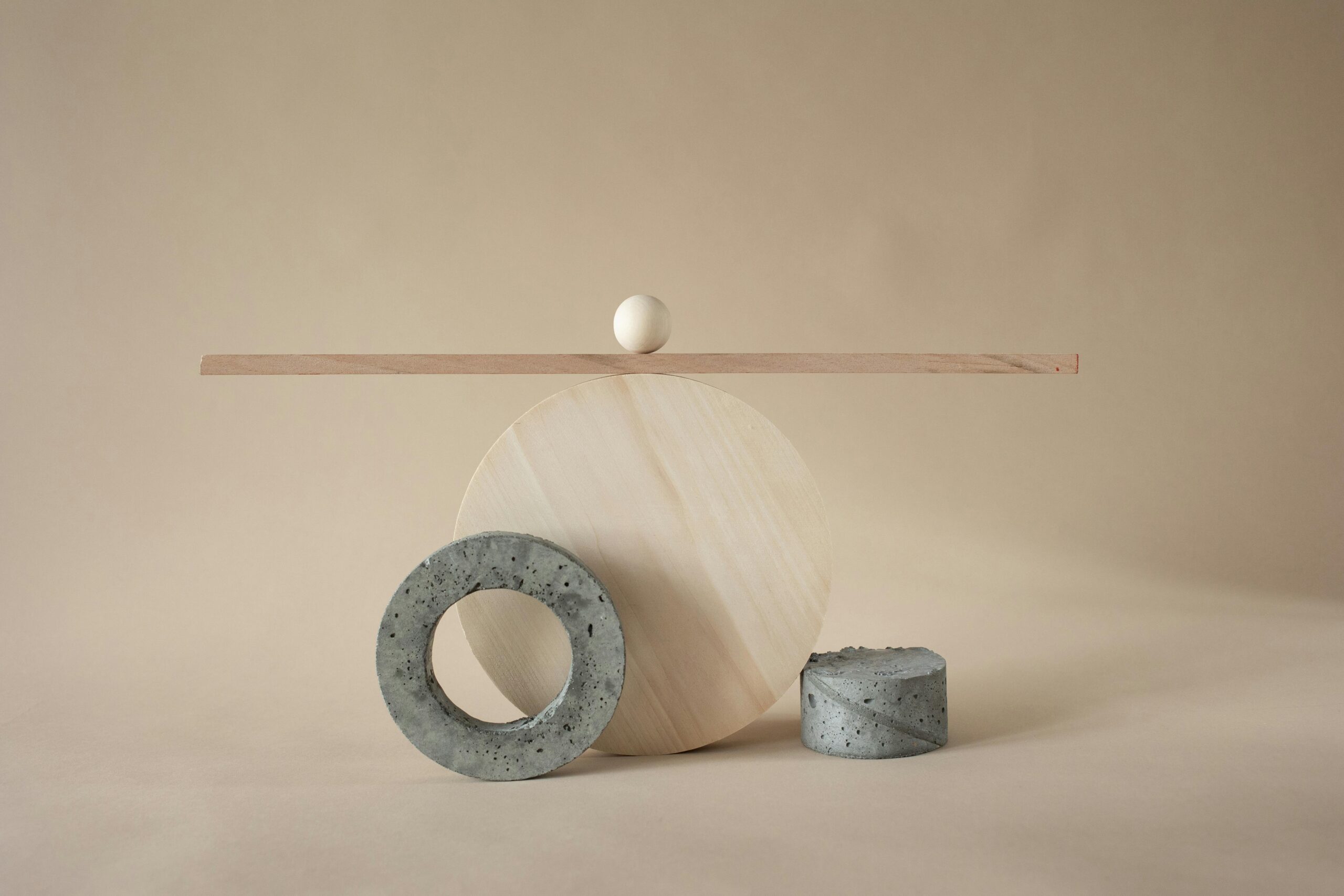
Visual weight distribution is the invisible force that transforms ordinary designs into captivating experiences that draw viewers in and guide their eyes exactly where you want them to go.
🎨 The Foundation of Visual Balance in Design
Understanding visual weight is fundamental to creating designs that feel complete and professional. Visual weight refers to the perceived heaviness or lightness of elements within a composition. Just as physical objects have weight that affects how we arrange them in space, design elements possess visual properties that determine how they interact within a layout.
Every element in your design carries a specific visual weight based on multiple factors including size, color, texture, position, and complexity. A large red circle commands more attention than a small gray dot. A complex illustration draws the eye more strongly than plain text. These principles govern how viewers navigate and interpret your creative work.
Mastering visual weight distribution allows designers to create hierarchy, establish focal points, and guide the viewer’s journey through the composition. Without proper balance, designs feel chaotic, uncomfortable, or confusing. With skillful application of these principles, your work achieves harmony that resonates with audiences on an intuitive level.
Understanding the Different Types of Balance
Balance in design manifests in several distinct forms, each creating unique visual experiences and emotional responses. Recognizing these types empowers you to make intentional choices that align with your creative vision and communication goals.
Symmetrical Balance: The Power of Mirror Images
Symmetrical balance divides a composition into two identical or nearly identical halves. This classical approach creates formal, stable, and trustworthy impressions. Corporate logos, traditional architecture, and formal invitations frequently employ symmetrical balance to convey professionalism and reliability.
The human brain finds symmetry inherently pleasing because it requires minimal cognitive processing. We recognize patterns instantly, creating a sense of order and predictability. However, perfect symmetry can sometimes feel static or boring if not executed with sophistication and subtle variation.
Asymmetrical Balance: Dynamic Tension and Visual Interest
Asymmetrical balance achieves equilibrium through contrasting elements rather than mirrored repetition. A large element on one side might balance multiple smaller elements on the opposite side. Different colors, textures, or shapes work together to create visual stability without identical distribution.
This approach generates dynamic energy and visual interest while maintaining compositional harmony. Modern web design, editorial layouts, and contemporary branding heavily favor asymmetrical balance for its ability to feel fresh, engaging, and sophisticated. The challenge lies in achieving balance that feels intentional rather than accidental.
Radial Balance: Energy from the Center
Radial balance radiates from a central point, with elements arranged in a circular pattern around the focal center. This creates natural movement that draws the eye inward or outward, depending on the design intent. Mandalas, logos, and certain interface designs utilize radial balance effectively.
This type of balance feels organic and harmonious, often evoking feelings of unity, wholeness, and completeness. It works particularly well for designs emphasizing community, cycles, or centralized concepts.
⚖️ Key Factors That Influence Visual Weight
Multiple variables contribute to an element’s perceived visual weight. Understanding these factors enables precise control over how viewers experience and navigate your designs.
Size and Scale Considerations
Larger elements naturally carry more visual weight than smaller ones. This principle seems obvious, but the relationship between size and weight is nuanced. A small element with high contrast or vibrant color can compete with larger, more neutral elements for visual attention.
Scale relationships within a composition matter tremendously. The difference between element sizes creates hierarchy and emphasis. Dramatic scale contrasts generate visual excitement, while subtle variations produce sophistication and refinement.
Color Intensity and Temperature
Warm colors (reds, oranges, yellows) advance visually and carry more weight than cool colors (blues, greens, purples) which recede. Saturated, vibrant colors demand more attention than muted or desaturated tones. Dark values typically feel heavier than light values.
A small splash of bright red can balance a large area of pale blue because the red carries disproportionate visual weight. Understanding color psychology and perception allows strategic placement of chromatic elements to achieve perfect equilibrium.
Texture and Complexity
Complex textures, detailed illustrations, and intricate patterns carry more visual weight than smooth, simple surfaces. A highly detailed photograph commands attention differently than a solid color block of the same size.
This principle explains why busy backgrounds can overwhelm foreground elements and why minimalist designs often feel balanced despite asymmetrical arrangements. The complexity itself becomes a weight factor requiring careful consideration.
Position and Placement
Elements positioned at the edges or corners of a composition carry more weight than those near the center. Top-positioned elements feel heavier than bottom-positioned ones. The cultural reading direction (left-to-right in Western cultures) also influences perceived weight distribution.
Strategic placement allows designers to balance compositions using position as a counterweight to other factors. A small element in the corner can balance a larger element near the center through positional advantage.
🎯 Practical Techniques for Achieving Visual Balance
Translating theoretical knowledge into practical application requires deliberate techniques and thoughtful experimentation. These methods help designers create balanced compositions across various media and contexts.
The Squint Test Method
Squinting at your design blurs details and reveals the overall weight distribution. This simple technique helps identify areas that feel too heavy or too light. If one region appears significantly darker or more cluttered when squinting, you’ve likely found a balance issue.
This method works because it reduces your composition to basic shapes, values, and masses—the fundamental building blocks of visual weight. Regular squint testing during the design process prevents balance problems before they become entrenched.
Grid Systems and Structural Framework
Grid systems provide mathematical frameworks that naturally encourage balanced layouts. Whether using simple column grids or complex modular systems, grids help distribute elements proportionally across the design space.
The rule of thirds, golden ratio, and other mathematical proportions offer tested formulas for pleasing balance. While grids shouldn’t constrain creativity, they provide helpful scaffolding that makes achieving balance more intuitive and systematic.
Negative Space as Balancing Element
Negative space—the empty areas surrounding design elements—functions as an active component in weight distribution, not merely leftover background. Strategic use of negative space creates breathing room, emphasizes important elements, and contributes to overall balance.
Asian design traditions particularly excel at leveraging negative space as a design element equal in importance to positive elements. This approach creates sophisticated, refined compositions that feel balanced despite minimal content.
💡 Common Balance Mistakes and How to Avoid Them
Even experienced designers occasionally struggle with balance. Recognizing common pitfalls helps prevent these issues in your work.
Overcrowding One Area
Placing too many elements in one region creates visual congestion that throws the entire composition off balance. This often occurs when designers try to fit too much information into limited space or fail to edit content ruthlessly enough.
The solution involves redistributing elements, removing unnecessary components, or expanding the composition area. Sometimes the best design choice is removing elements rather than adding balancing counterweights.
Ignoring Visual Weight Hierarchies
When all elements carry similar visual weight, nothing stands out and everything competes for attention. This creates flat, confusing compositions without clear focal points or navigation paths.
Establishing clear hierarchies through deliberate weight distribution guides viewers through the design in your intended sequence. Primary elements should dominate, secondary elements support, and tertiary elements provide context without competing.
Forgetting Mobile and Responsive Contexts
A composition perfectly balanced on desktop screens may become unbalanced when viewed on mobile devices. Responsive design requires considering how weight distribution changes across different viewport sizes and orientations.
Testing designs across multiple devices ensures balance remains effective regardless of viewing context. Sometimes this requires creating alternative layouts for different screen sizes rather than simply scaling elements proportionally.
🖼️ Balance Across Different Design Disciplines
Visual weight principles apply universally, but their application varies across different design specializations. Understanding context-specific considerations enhances your effectiveness in each discipline.
Web and Interface Design
Digital interfaces require functional balance that supports usability alongside aesthetic considerations. Navigation elements, content areas, and interactive components must distribute weight in ways that feel natural and guide user behavior effectively.
Z-patterns and F-patterns describe how users scan web pages, creating natural weight distribution expectations. Designers can work with or against these patterns intentionally, but ignoring them entirely typically produces frustrating user experiences.
Print and Editorial Design
Magazine layouts, posters, and print advertising face unique balance challenges related to physical formats and reading patterns. The gutter (center fold) in multi-page spreads requires special consideration, as does the relationship between facing pages.
Print design allows more predictable control over viewing conditions compared to digital design, enabling precise balance calculations. However, the permanence of print means balance mistakes cannot be easily corrected after production.
Photography and Fine Art
Photographic composition relies heavily on visual weight distribution to create compelling images. The placement of subjects, use of depth of field, and manipulation of light all contribute to compositional balance.
Fine artists throughout history have intuitively understood visual weight, creating masterworks that demonstrate perfect balance despite often complex, asymmetrical arrangements. Studying classical paintings reveals timeless balance principles applicable to contemporary design.
🔧 Tools and Resources for Analyzing Balance
Modern designers have access to numerous tools that help analyze and achieve visual balance more effectively than ever before.
Design software often includes guides, grids, and alignment tools that facilitate balanced layouts. Adobe Creative Suite, Figma, Sketch, and other professional applications provide features specifically designed to support compositional balance.
Color analysis tools help evaluate the weight distribution of chromatic elements. Heat mapping software reveals where viewers actually look, providing empirical data about visual weight distribution effectiveness. These analytical approaches complement traditional design intuition.
Photography apps with composition overlays help visualize rule-of-thirds grids and other structural frameworks directly in the camera viewfinder, making balanced composition easier even for beginners.
Developing Your Balance Intuition Over Time
While understanding principles provides essential foundation, developing intuitive feel for balance requires practice and intentional observation. Train your eye by analyzing designs you encounter daily—advertisements, websites, packaging, architecture.
Ask yourself why certain compositions feel balanced while others seem off. Identify which elements carry the most visual weight and how designers achieved equilibrium. This active analysis transforms passive viewing into learning opportunities.
Create balance studies by deliberately designing with different balance types. Practice symmetrical compositions, then redesign the same content asymmetrically. Experiment with radial arrangements. This hands-on exploration builds muscle memory and intuitive understanding.
Photography exercises develop balance awareness quickly. Compose shots using various balance approaches, reviewing results to understand what works and what doesn’t. The immediate feedback photography provides accelerates learning.
🌟 The Emotional Impact of Balanced Design
Balance isn’t merely aesthetic—it profoundly affects how viewers emotionally respond to your work. Balanced designs feel trustworthy, professional, and intentional. They communicate that someone thoughtful created this experience specifically for the viewer.
Imbalanced designs create unease, confusion, or frustration. While occasionally designers intentionally create imbalance for specific effects, understanding the emotional consequences allows conscious choice rather than accidental outcomes.
Cultural contexts influence balance perceptions. Western audiences have different balance expectations than Eastern audiences based on cultural design traditions. Global design requires sensitivity to these varying perspectives and preferences.
The psychological comfort of balance taps into deep human preferences for order, pattern recognition, and environmental predictability. When designs respect these preferences, they feel welcoming and accessible. When they violate balance expectations without clear purpose, they alienate audiences.
Advanced Balance Concepts for Expert Designers
As skills develop, designers can explore more sophisticated balance applications that create distinctive, memorable work while maintaining compositional harmony.
Tension balance deliberately creates near-imbalance that generates dynamic energy without tipping into chaos. This advanced technique requires precise calibration—too little tension feels boring, too much feels unstable. Mastering this edge produces electrifying designs.
Progressive balance guides viewers through sequential focal points using carefully orchestrated weight distribution. Each element leads naturally to the next, creating narrative flow within static compositions. Editorial design and infographics particularly benefit from progressive balance approaches.
Crystallographic balance distributes elements evenly across the entire composition without clear focal points, creating pattern-based designs. While challenging to execute effectively, this approach works beautifully for backgrounds, textiles, and decorative applications.
🎓 Transforming Theory Into Masterful Practice
Understanding visual weight distribution separates adequate designers from exceptional ones. These principles underpin every successful composition across all visual disciplines, functioning as the invisible architecture that makes great design work.
Begin applying these concepts immediately in your current projects. Analyze existing work for balance issues and opportunities. Experiment deliberately with different balance approaches. Share work with others and solicit honest feedback about whether compositions feel balanced.
Remember that rules exist to be understood before being broken. Master traditional balance first, then experiment with intentional imbalance for specific effects. The difference between amateur imbalance and expert tension lies in understanding the principles you’re manipulating.
Visual weight distribution isn’t a rigid formula but a flexible framework that adapts to infinite creative possibilities. Your unique vision combined with solid balance fundamentals creates distinctive work that stands out while remaining accessible and effective.
The journey toward mastering balance continues throughout your entire creative career. Each project presents new challenges and opportunities to refine your understanding. Embrace this ongoing learning process, knowing that even small improvements in balance awareness produce dramatically better results in your finished work.